A full 180: Crafting the visual identity for a cutting-edge commercial hub with a unique form.
The pride of Mangalore - India's emerging commercial hub
Mangalore deserves more attention than it currently gets as a focal centre of business and innovation, and this project in its growing commercial district is set to accelerate it.
We looked to its distinct triangular shape and blend of form and function to craft its identity.

One line then defined the brand - from its construction and layout to the visual identity that we then built.
This defined the brand - from its construction and layout to the visual identity that we then built.

The vortex of it all
Everything originated from the shape of the project itself.

A triangular layout of this sort was striking and uncommon. We wanted its visual identity to be the same.

As we looked at this project from all angles, we saw facets that we had to consider from a visual, and business point of view. The challenges were unlike others we had faced, and we were all set to experiment and make it work.
The goal is global
The clientele Expertise wanted to attract were global companies setting up HQ in South India, and cutting-edge new ventures. Our design approach and inspirations catered to both, as well as the benchmarks of global architecture and design.


Angles of the right type
After multiple explorations, we landed on F37 Incise as the project’s primary typeface. It was bold, and used the kind of triangular shapes that seemed tailor-made for this project.


Sleek, understated, luxurious colour.
We kept the palette simple yet versatile with a muted shade of blue with a luxurious beige to offset it.


Directional Signages
A key consideration within the space was accessibility and clarity, which we achieved through intuitive and easy to interpret icons, paired with concise language on signages.


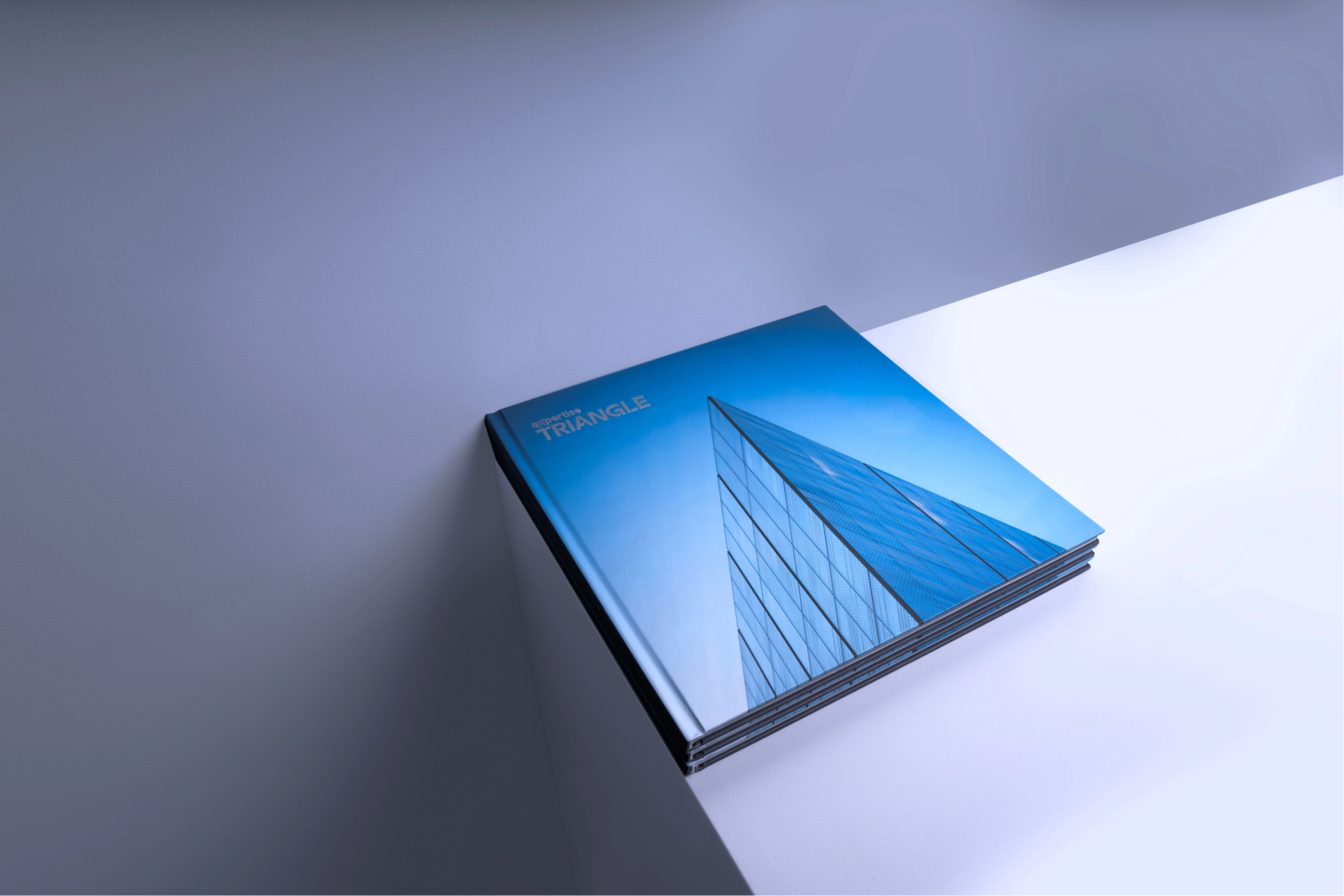
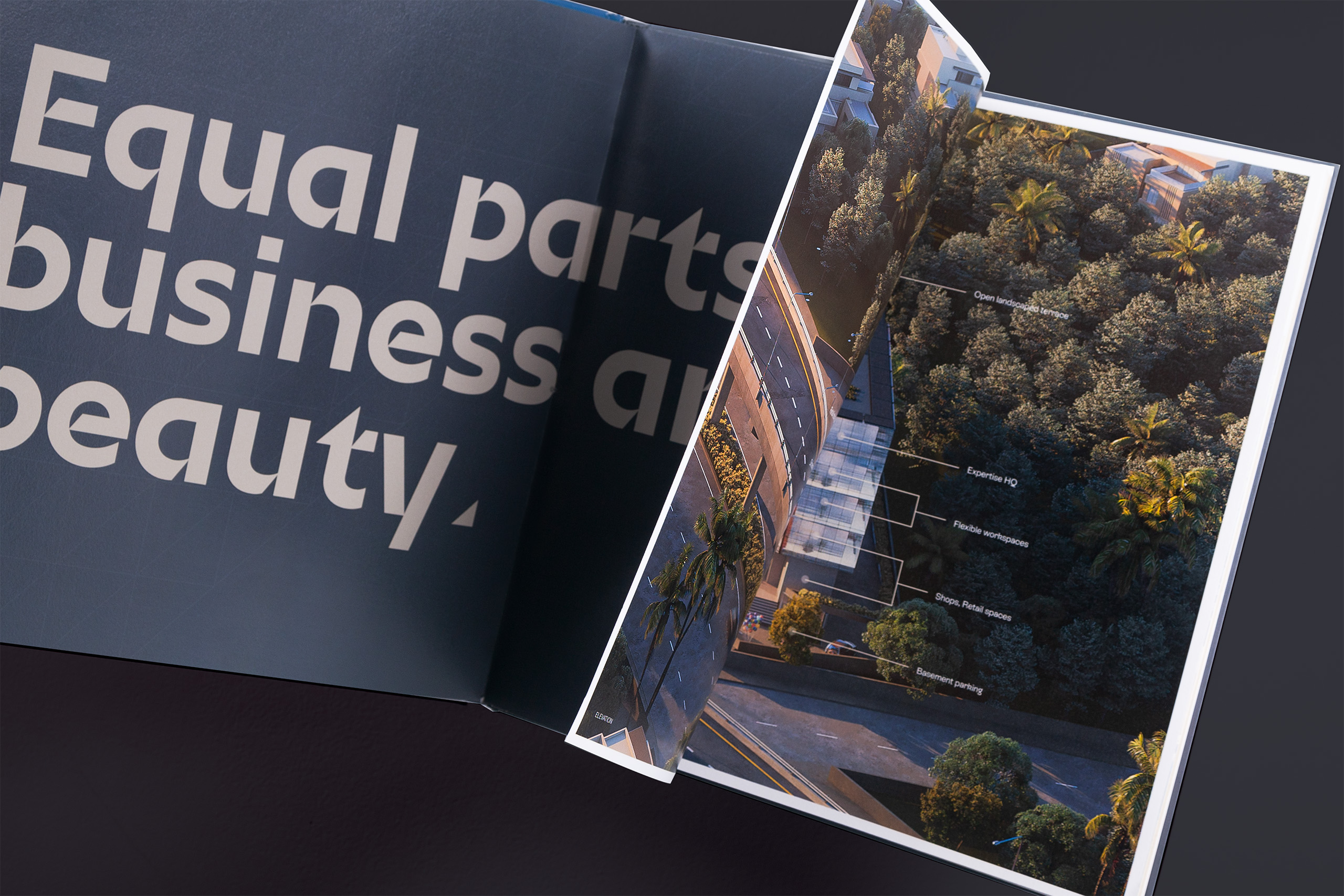
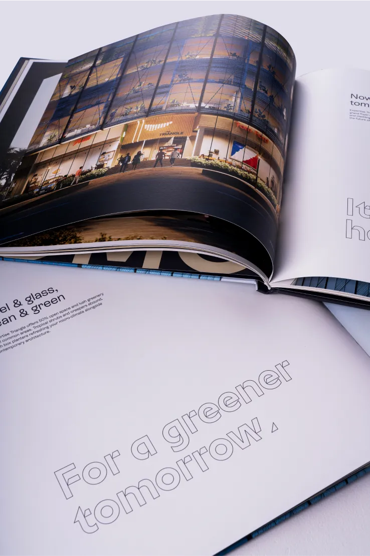
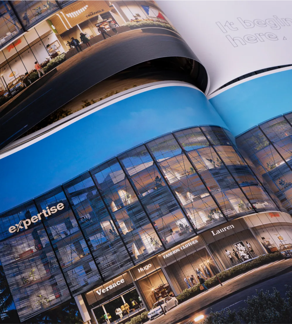
A visionary brochure
The brochure is where we could really go all out with using the triangle shapes and various formations to create a geometric piece of art.
.webp)


In the website, the juxtaposition of the filled and outlined versions of the text created an interesting interactive element which highlighted the angles and unique geometric elements of the entire project.
The future of workspaces.
The future of Mangalore.
We took a project that was triangular in layout, contemporary in design, and far-reaching in vision and created a visual identity that did the client’s vision justice. The branding was acutely different from other commercial projects across India while being deceptively simple and hence all the more impactful.