This structure was redefining Nashik's skyline. We redefined how a commercial space could be portrayed through design.

Client

Bagad Properties

Industry

Real estate

Duration

6 months

Year

2021

Scope of Work

Brand Identity
Publication Design
Digital Design
VISIT LIVE WEBSITE

Styled to perfection

At the junction of historic and avant-garde.

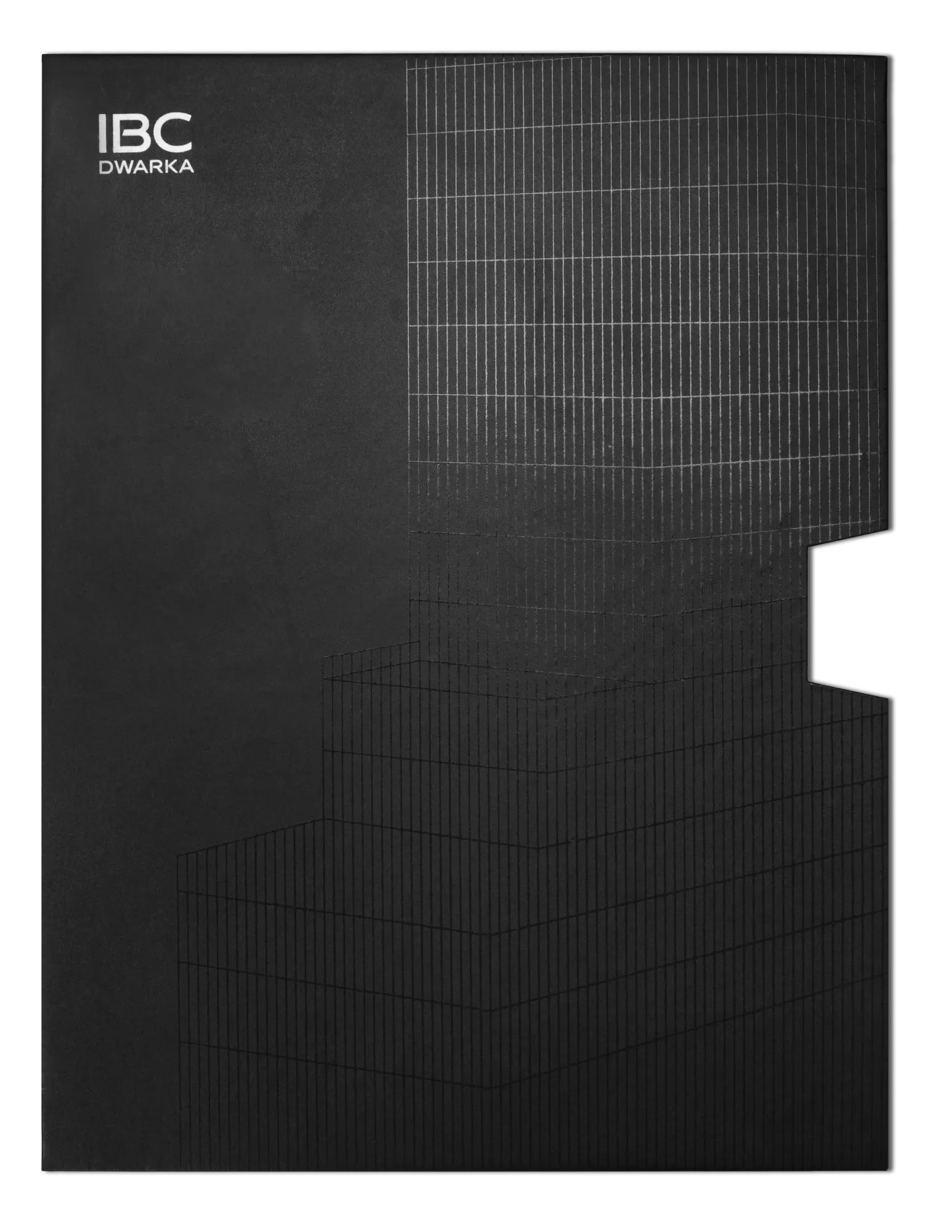
IBC was a structure that was set to transform the skyline of Nashik. Its premium New York downtown-style step architecture was taking Nashik’s business district years into the future, and we wanted its identity to establish that from first glance.

It’s all in the lines

IBC’s facade is clean and contemporary. We drew inspiration from the different elements of the construction and created a sleek, minimalist identity that synced perfectly with the structure itself.

An identity derived from the project’s stunning, larger than life glass facade.

We created a sharp visual approach that was heavy on straight lines, but rather light on the eyes. Shades of grey were our primary colour palette to convey elegance, with understated silver accents adding a touch of luxury.

IBC Main Grey

Plain white

Platinum Frost

Granite Grey

Graphite

Steel Shadow

Built on a location that was a landmark connecting it to the city’s past, IBC Dwarka aimed to be the beacon of the future of Nashik. Its identity was designed to appeal to new-age and traditional business owners, customers, and decision-makers who would forge Nashik into the next metropolitan business and lifestyle hub.

ibc dwarka white logo
ibc dark full logo

Elements we explored to make IBC iconic

Grids

Taking inspiration from the long vertical glass panes of IBC’s facade, and beautiful glass cubicles.

Blurs

To show how scenes look when seen through the brilliant surface of reflective glass.

Patterns

Simple line-based patterns, iconography and illustrations- derived from IBC’s serrated glass edges and vertical panels.

Premium to its core: Materials that exude the IBC elegance through every medium

We had created a luxurious and compelling visual direction for the brand, which had the potential to be one-of-a-kind when expanded into the physical space. We researched different substances and materials to choose just the right one that told IBC’s story of sophistication through every piece of collateral.

Scaling from web

A website with impeccably intuitive interactive features that were designed to convey the project’s cutting-edge nature.

To print

The brochure sleeve was treated with blind spot UV to make an impression from the word go. Once the brochure was being perused, readers would see pages treated with matte silver foiling on the brochure’s line illustrations to add a subtle sheen to the already lavish experience. 

To signages

Stainless steel was used for everything from hoardings to wayfinding signages to convey the attention to detail and finish we wanted.

To spaces

Glass panel offset was used on the site wrap board for an eye-catching interplay of light, lines, images, and type.

To wearables

When everything else was so sleek, why should ID cards be any different? Transparent acrylic was used to make them as cutting-edge as the rest of the deliverables.

Bringing IBC’s aura to the web

After the impeccable branding, brochure, and on-ground collateral we had crafted, IBC’s website had to tell the same story. Luxury and elegance were paramount and the site was crafted to create an experience that highlighted just that.

Interaction with meaning

Everything was upfront with a few notable exceptions, like the interactive amenities list that highlights just how much there is to discover within IBC.

Icons with an impact

A few simple lines can add so much nuance. Our specially designed icon set served to highlight the features and amenities of IBC, eliminating the need to describe each of them in detail.
Primary Font : Euclid Circular B (medium)
Marathi Font : Poppins family
Secondary Font :  Made Mirage (Regular)
Body Font : Euclid Circular B (light)

The folks creating the iconic

We’re proud of our team who gave this project its all, from multiple design iterations to web experiments that had the potential to be pretty amazing. One example is a 3D walkthrough of all the floors of the building, recreating its glass facade. The team played around with a nascent 3D tool to get just the right effect and while we couldn’t work out all the bugs, we had a lot of fun learning a new way to display project features. We’re sure it’ll come in handy in the future. Until then, signing off from IBC Dwarka, a standout project that we loved working on just as much as the client loved the results.