Rebranding to reflect the goal of resilience against all odds.
Client
Kshema
Industry
Insurance
Duration
3 months
Year
2024
Scope of Work
Brand Identity
.jpg)
A shift towards protection & assurance in every interaction
Kshema is India’s first fully digital D2C farmer-focused general insurance provider. We embarked on a journey to redefine its identity to help it resonate more deeply with its core audience - the farmers.
The old Kshema identity was characterised by its crane emblem - a symbol of agricultural support and flight. It served well to establish its foundation but as the brand grew — both in terms of revenue and scope of offerings, — they soon saw the need for a more inclusive, direct, and impactful visual language with a defined, stable and scalable system.
The old Kshema identity was characterised by its crane emblem - a symbol of agricultural support and flight. It served well to establish its foundation but as the brand grew — both in terms of revenue and scope of offerings, — they soon saw the need for a more inclusive, direct, and impactful visual language with a defined, stable and scalable system.
.jpg)
.jpg)
.webp)

The design team first experimented with retaining the crane motif in a new format. Over multiple explorations, the wing element of the bird was integrated with the letter 'K' in Kshema, and became a symbol of the young crop that sprouts from the ground. The new wordmark is a simple yet significant one, grounded, bold, in the hues of the sky and warm fields, and an evolution of what came before.
This arm on the 'K' became the standout design element that evolved further into a simple yet impactful design system, emphasising sustainability and prosperity as defined from the lens of farmers themselves.
.jpg)
.jpg)

Before
.webp)
After

Type that exudes trust
.jpg)
The brand font - Helvetica - was chosen to reflect the brand’s core beliefs of trust, security, and professionalism. To ensure inclusivity across India, Anek was chosen as our regional language typeface. These allowed us to communicate consistently with our diverse audience.
.jpg)
.jpg)
.jpg)
.jpg)
Kshema's shades instantly connect with their audience and reflect Kshema's deep-rooted connection with agriculture.
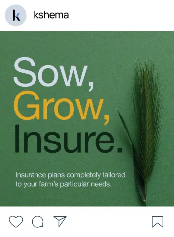
The colour palette is entirely reminiscent of the shades found in nature. The yellow symbolises a farmer's crops. The blue represents the open sky. A newly added muted green bridges the gap between warm and cool tones, the range of which reflects the brand’s core beliefs of trust, security, community, and growth.
The colour palette is entirely reminiscent of the shades found in nature. The yellow symbolises a farmer's crops. The blue represents the open sky. A newly added muted green bridges the gap between warm and cool tones, the range of which reflects the brand’s core beliefs of trust, security, community, and growth.
.jpg)
.jpg)
Creating a visual narrative of joy, resilience, and empowerment centering around Indian farmers.
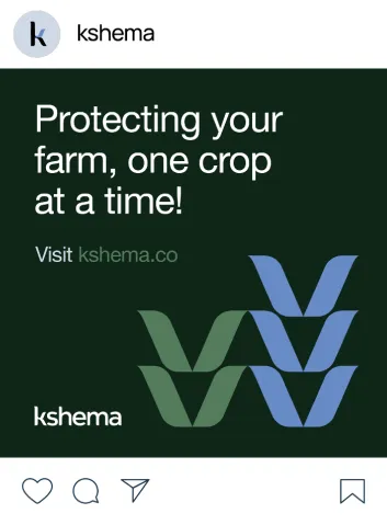
The arm on the 'K' evolved into containers and elements, most significantly the versatile crop motif.
The language and colours were simple and easy to relate to. The imagery was defined to be vibrant and hopeful visuals that celebrate the farmer's life.


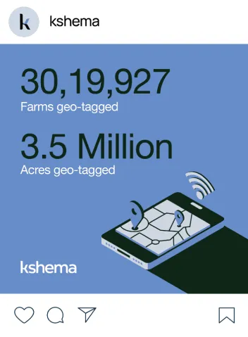
The illustrations we created captured the essence of a farmer's daily life. These use isometric structures to depict relatable scenes from crop cultivation to handling insurance documents — making the design system more dynamic for its audience.
.jpg)
.jpg)
.jpg)
.jpg)


.jpg)
.jpg)
.jpg)
.webp)
.jpg)
We explored many possibilities of retaining the old crane motif in a new format, and a checkmark signifying insurance.
