Building an interactive guide to studying abroad that fits right in your pocket
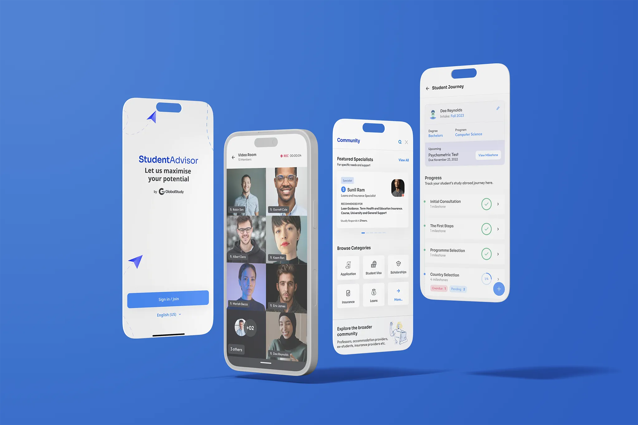

Global Study Tech was a comprehensive portal that helped students study abroad, right from choosing a university to navigating housing solutions in the new country.
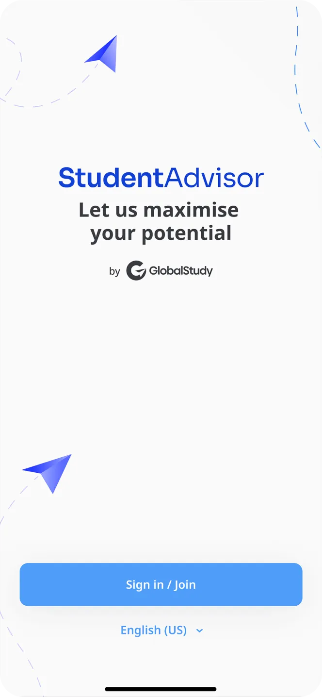
As part of the brand’s new offerings, we were tasked with building the Student Advisor app for launch in 8 countries.
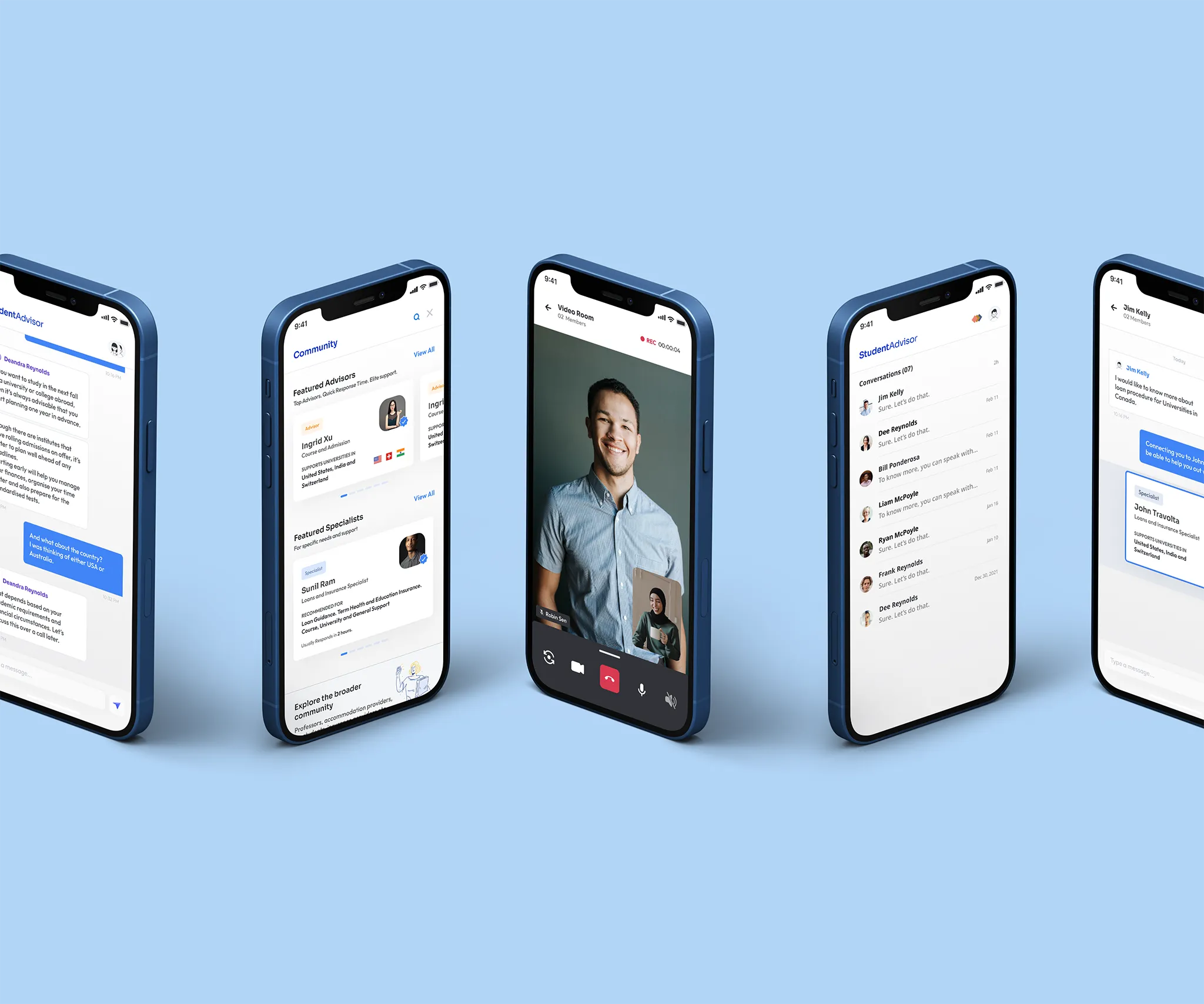
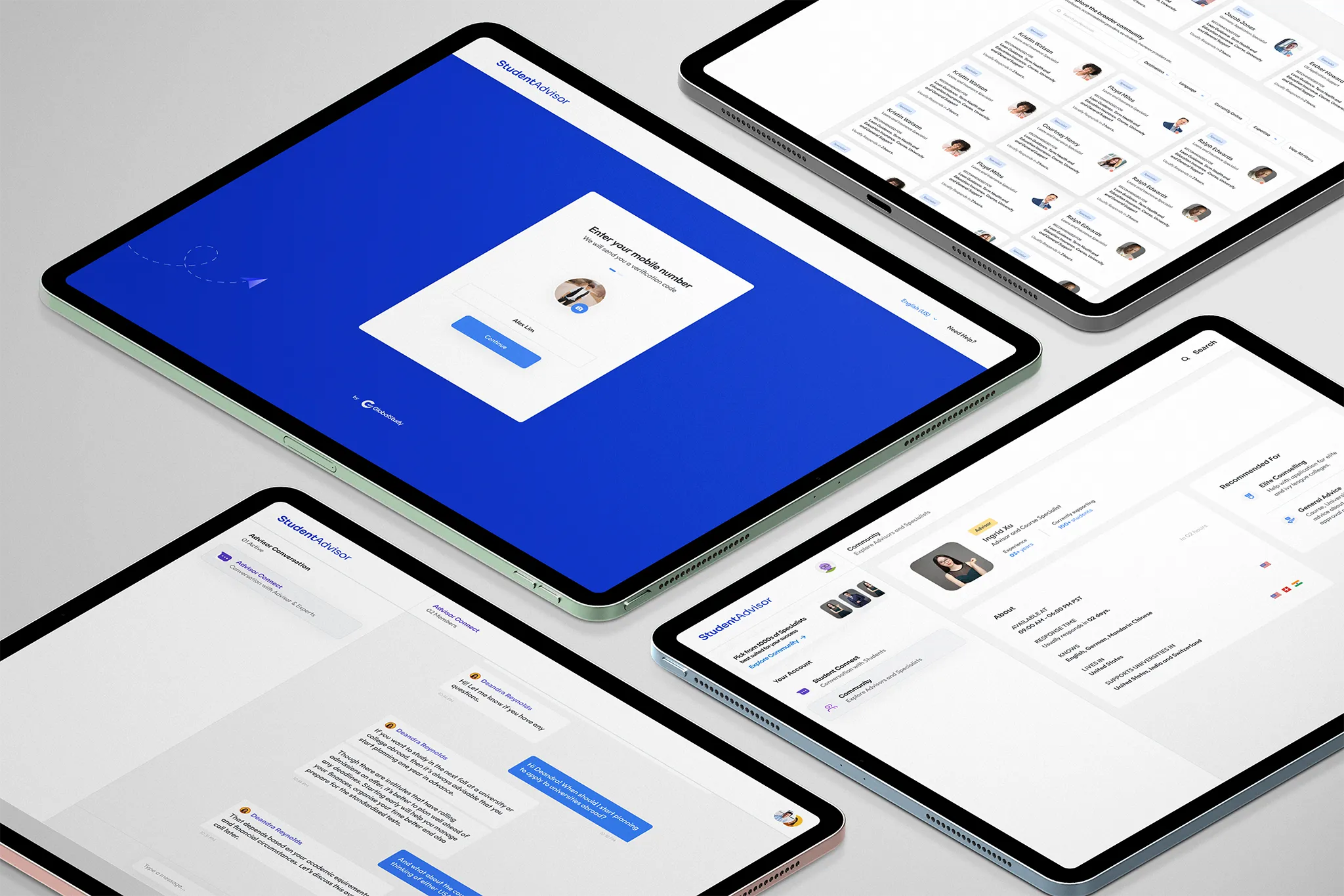
This was meant to give students access to dedicated advisors via text or video rooms.
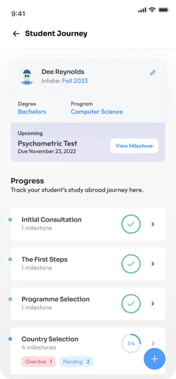
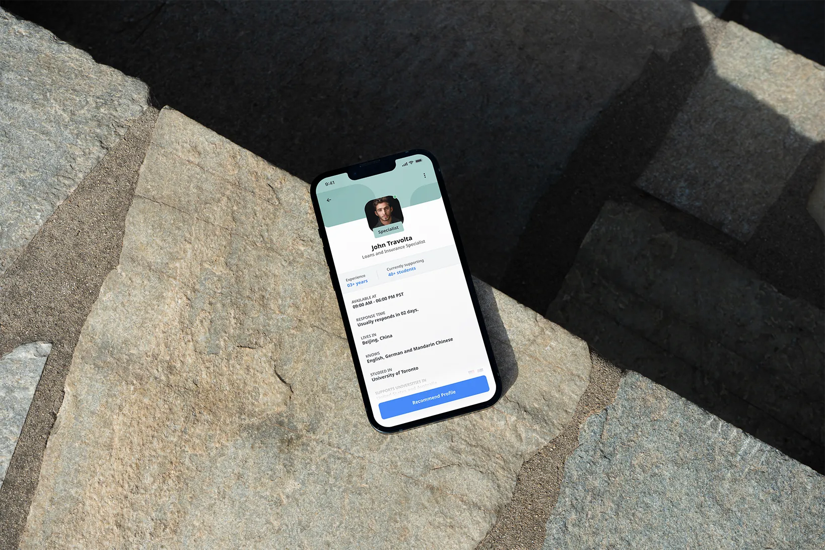
It was also a portal for advisors to access their students along with comprehensive tools to support and manage them including ways to research, document, and stay updated on student journeys.
THE CHALLENGE
Building the MVP for this app came with several hurdles.
Our designs had to account for scaling.
While also being future-proof. Quite a double-edged sword!
Two distinct audiences of students and advisors.
This gave rise to our core challenge of product management and planning.
Abiding by global cultural and language guidelines.
Since our audiences were scattered across the world.

Agile is Everything
StudentAdvisor was built in an iterated agile manner. We worked with team of developers to ship an MVP, while parallely getting feedback from the audience and incorporating it in future builds of the platform.
User Flows and Prototyping
Data Gathering Workshops
Design System Integration
Data Analytics and Interviews
User Flows and Prototyping
Data Gathering Workshops
Design System Integration
KPI and Scoping
Wireframing
A/B Testing
User/Build Testing
UX Writing
Development
KPI and Scoping
Wireframing


Going Global

1000+
8
The diversity and range of our audience required us to look at every aspect of the product with a cultural context filter. For instance, visuals and comms needed to be depicted with the cultural sensitivity required for Saudi Arabian users while application flows had to be aligned with the usage patterns of Chinese users.
We even worked on language localisation by collaborating with linguists and native speakers to align the tone of voice and copy for all users.

A home for the app
We created a simple and easy-to-understand landing page to promote the app and explain how it works.
This page was meant to appeal to students to download the app and was hence designed to be more engaging with multiple animations.
While this page was an extension of the Global Study main website, it was designed to look a bit different with whites and greys deviating from the dark blue of the main site, so that it could stand as a separate product.

An elegant and functional MVP that’s currently available in 8 countries for students looking to connect with advisors.
An app which was quickly adopted by advisors, with feedback and suggestions that are under development.

